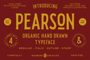
Pearson: A Design Resource for Modern Branding
Practical Applications Across Creative Disciplines
• Branding & logo design: Clean sans-serif typography paired with muted, professional color schemes (navy, slate gray, warm coral accents) supports trustworthy, forward-thinking brand identities—ideal for edtech startups or academic institutions seeking modern relevance.
• Social media graphics: Consistent iconography, modular grid layouts, and bold yet readable headline treatments translate seamlessly into Instagram carousels, LinkedIn banners, and TikTok explainers—enhancing shareability without sacrificing clarity.
• Web & UI design: Pearson’s emphasis on accessibility—such as sufficient contrast ratios, scalable text, and logical tab order—serves as a benchmark for inclusive digital experiences, directly supporting UX design best practices.
• Packaging & print design: From certification study guides to interactive workbooks, Pearson’s tactile design choices—matte finishes, strategic spot UV, and intuitive icon-led navigation—offer inspiration for physical product launches requiring both aesthetic polish and functional intuitiveness.
Selecting & Integrating Design Assets Thoughtfully
- Scalability: Will this typeface remain legible at 12px in a dashboard table and 96px in a keynote slide?
- Consistency: Can the same icon set, spacing system, and tone of voice function equally well in a PDF report and a mobile app interface?
- Audience alignment: Does the visual tone match how your users perceive expertise—e.g., clinical precision for healthcare, warmth for early education, innovation for tech upskilling?
- Workflow compatibility: Are assets available in vector, variable font, or Figma-ready formats to accelerate handoff between designers and developers?